[wpdreams_ajaxsearchlite]
The devil is in details when it comes to menswear. Never has this been more prominent than with a tie and pocket square. At first glance, it is an effortless way to elevate a tailored outfit. But, it can be fraught with pitfalls, so it is best we guide you through how to match these two accessories to perfection.
When we create synergy between our pocket square and tie, men must remember a fundamental style rule. Despite some brands' best intentions to palm off matching ties and pocket square sets into the hands of unsuspecting men. It is a sartorial no-no to execute this with a suit. Our pocket square needs to complement, not match, our tie.
Challenging as it might seem, we can complement these two menswear pieces by harmonising or contrasting them. The latter, for most men, will be at odds with their current manner of dressing. Though, it isn't as scary as it might first sound.
As we step back to asses our outfits, the impression we want to give is of looking carefully put together without being too studied. Layering on a pocket square must work with our suit and not become a distraction.
Understanding how colours work together is crucial to feeling confident when approaching colour matching. Once you nail this, men can apply the same rules to any key partnership in their daily attire - shoes, belts, ties and even shirts. They all need to look nice paired with other pieces. To do this we need to focus on the colour wheel.
To start with, there are similar colours. These are hues that are close to each other on the wheel. Grey and black, for example, or light and dark blue. Subconsciously, this is probably being applied to every outfit you put together. It is the easiest to master.
Next are complementary colours. Colours that sit opposite each other on the wheel. Here, one colour should become the base colour, while the second pick is an accent. Include the tri-facto of the suit colour in this as a great foundation to ground the colours you have chosen for the pocket square and tie.
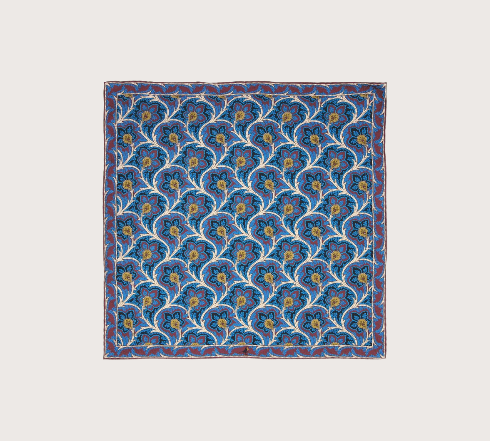
Finally, contrasting colours. Different hues, that, on paper, shouldn't work alongside each other, but somehow do. A lot of this can be down to perception. Though, some familiar choices include red and green or blue and orange. To soften the blow, focus on how shades can make the contrast more palpable.

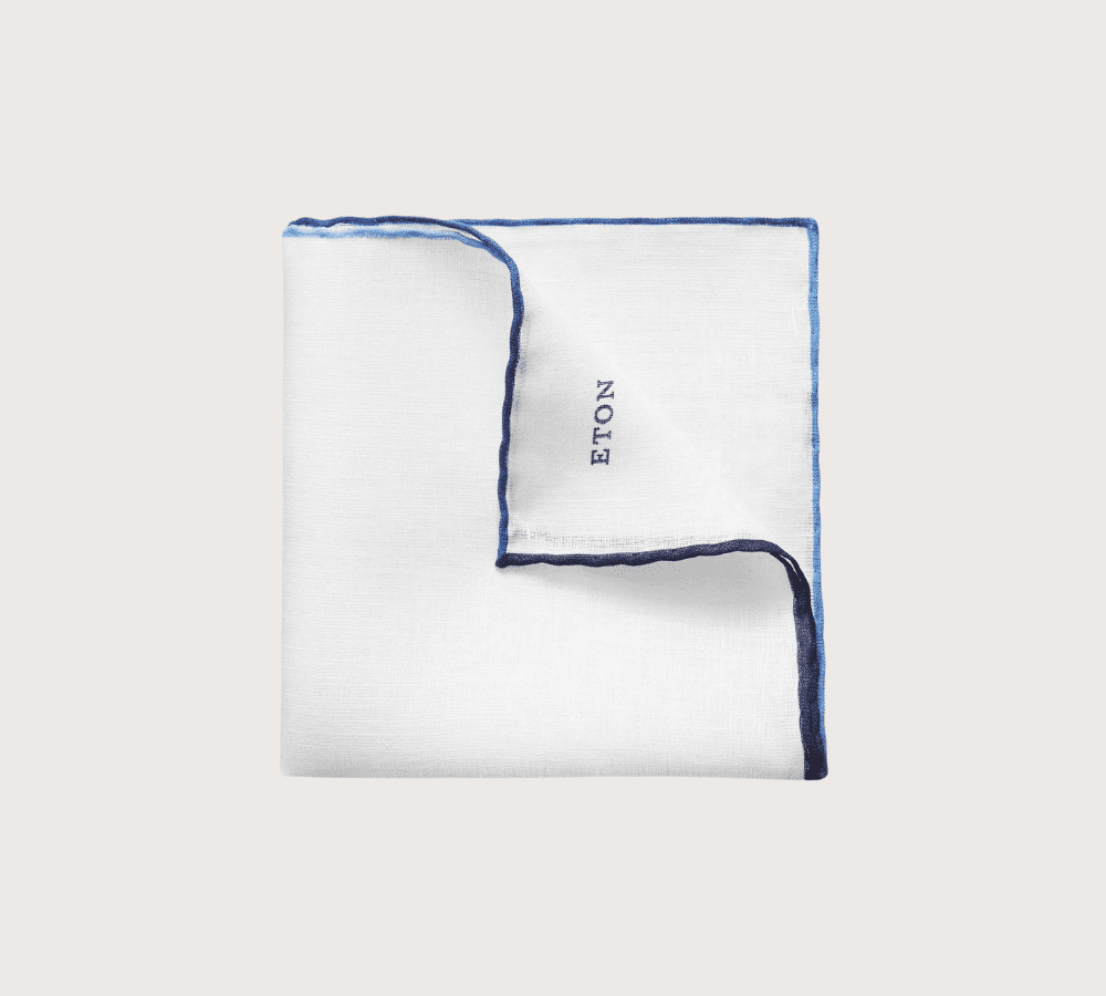
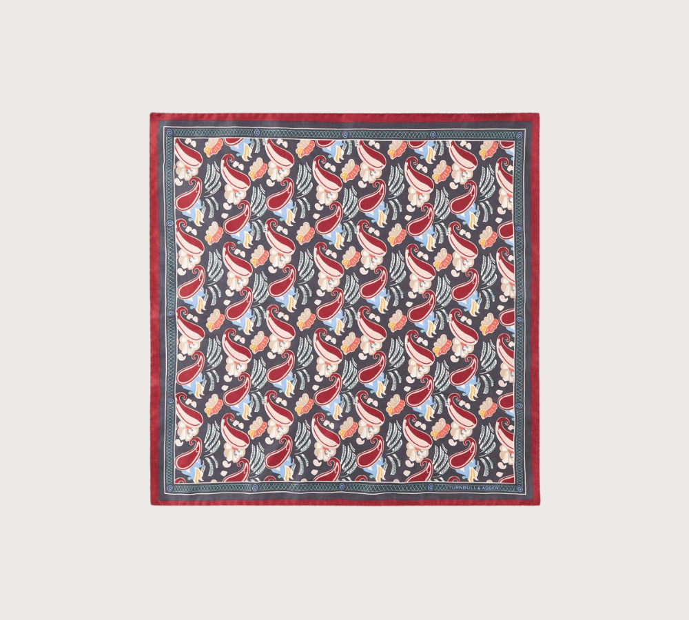
A shortcut to unified accessories is to pick a pared-back neutral palette. Both in colour shades and understated design. Whereas identical accessories take this too far and show a lack of ingenuity. Complimentary colours are a great way to show you understand how an outfit has to be put together, and you have made considered choices.
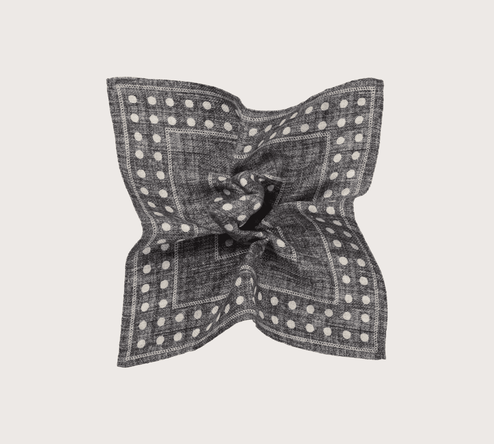
First, get the base colour right. Pick the same or similar (a shade lighter or darker) to a colour element in your tie. For example, this could be a navy blue border aligning with a navy stripe in the body of the tie. Once this is in place, then men can play with simple patterns like polka dot, paisley or checks if they so wish.
If in doubt, stick to colours you feel comfortable with, such as grey, blue, brown or white/cream. Adding bold, elaborate patterns is where we move into contrasting, so play safe with plain pocket squares as a beginner.
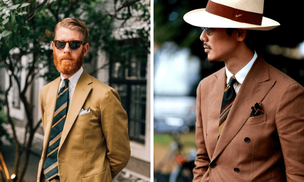

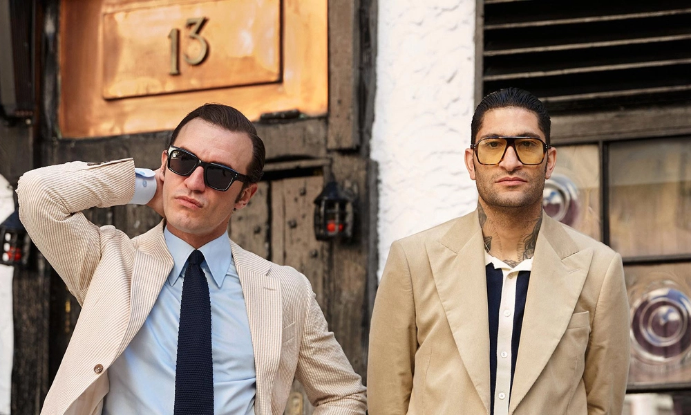
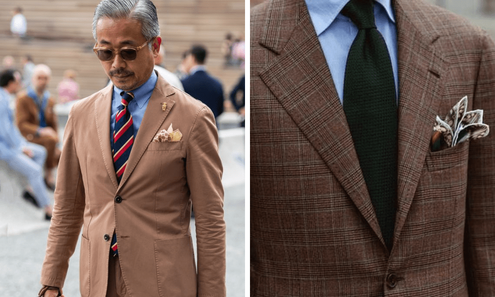
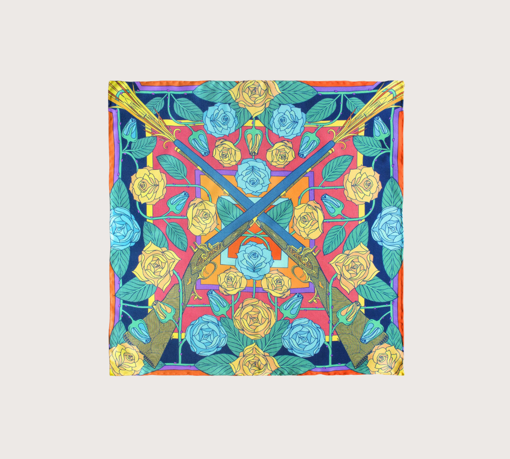
The alternative to matching is to go down the other end of the scale and contrast these two accessories.
To nail contrasting, men need to think "bolder the better". Both in terms of design but also fold. With both of the examples below, you can see that there is still a cohesive colour palette. It has just been elevated with bold patterns.
This flamboyant execution will draw the eye, and men should be mindful of this when preparing for a particular dress code.

We can also add visual appeal by selecting different materials for our accessories. Men will know how winter fabrics like wool add texture and interest. The same can be said of ties and pocket squares in various fabrics.
Silk - a perfect choice with pretty much everything. Just be mindful that it doesn't have a 'wet" finish, as this will appear too formal.
Wool - a standout pick in colder-weather
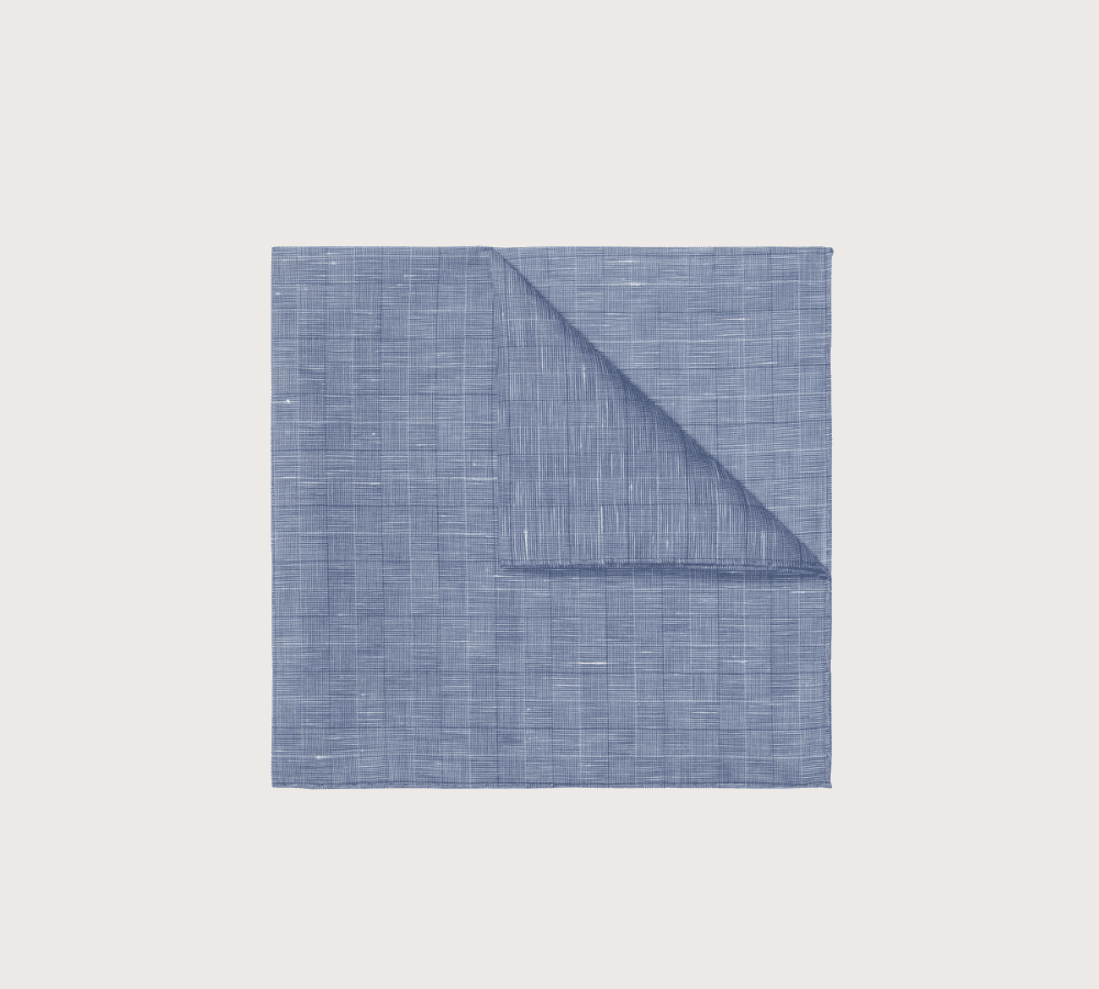
Linen - very versatile and a great option in the summer
Cotton - best kept for partnering with a summer suit
Be mindful that men should match their fabrics in nearly all cases. The only exception might be a plain white cotton or linen pocket square. Due to their unobtrusive nature, they allow themselves to be more readily mixed with different fabrics.
Hopefully, this guide has helped you to master the somewhat difficult task of matching your tie and pocket square. The key takeaway is to start small with a neutral, plain pocket square then build your confidence from there.
Other helpful reads when it comes to men's outfit building include: